Hero Blackletter Font for Bold Campaign Headlines
It was 3:47 p.m. on launch day—my screen split between a YouTube thumbnail mockup, an Instagram carousel draft, and a Pinterest pin preview. The client’s new online course series needed energy, edge, and unmistakable presence. I’d already cycled through three clean sans serifs—too safe. A script font? Too soft. Then I dropped Hero into the headline layer: “Unlock Your Voice.” Instantly, the composition tightened. Not because it was louder—but because it felt intentional. That’s when Hero stopped being just another blackletter font and became part of the campaign’s rhythm.
A Typeface That Speaks Before You Read It
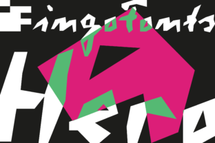
Hero is an abstract, stripped-back blackletter—no ornate flourishes, no medieval mimicry. Its letterforms are simplified but not softened: sharp terminals, confident angles, and generous negative space that keeps the texture breathable. It doesn’t shout “medieval scribe” or “gothic revival.” Instead, it lands somewhere between contemporary editorial design and underground zine culture—serious without stiffness, experimental without chaos.
In practice, that means Hero works best where you need attitude with clarity: a product teaser banner (“Coming Soon”), a Reels cover (“Watch This First”), or a limited-time offer label (“48 Hours Only”). It’s not about historical accuracy—it’s about visual punctuation. When layered over a high-contrast photo or placed against a solid dark background, Hero delivers instant hierarchy and tonal alignment. It tells your audience, *this moment matters*, before they process a single word.
Where Hero Earns Its Place in Real Campaigns
We used Hero across six touchpoints in a recent content series launch—and each time, its role shifted slightly based on context:
- YouTube thumbnails: Sized at 120px width on mobile previews, Hero held legibility better than expected—especially with bold weight and tight tracking. We avoided thin weights or ultra-narrow alternates here; the standard bold cut through fast-scrolling feeds.
- Instagram post headers: Paired with Inter (a neutral sans serif) for body copy, Hero anchored the top third of static posts. Its geometric simplicity prevented visual competition with photography or illustration.
- Pinterest pins: On vertical layouts, Hero’s tall x-height and open counters made short phrases (“Start Here”, “Free Guide”) pop even at thumbnail scale—no stroke distortion, no fuzzy edges.
- Digital ad banners (960×540): Used exclusively for primary headlines—not CTAs or subheads. Its strong silhouette ensured recognition at glance, especially in programmatic placements where attention lasts under two seconds.
- Webinar banners & email headers: Applied sparingly (one line max), always with at least 16px padding around the text block. On light backgrounds, we added a subtle 1px charcoal stroke to reinforce contrast.
- Branded template packs: Included as a “display-only” option—clearly labeled in documentation as unsuitable for body copy or captions under 24px.
Readability Realities—No Guesswork, Just Testing
Hero isn’t magic. It’s a display font—designed for impact, not endurance. On mobile, it reads cleanly down to ~28px headline size with generous letter-spacing. Below that, details blur, especially on OLED screens. We tested overlays on video stills: Hero stayed legible at 20% opacity over midtone imagery, but faded fast on busy textures or gradient backgrounds.
Dark mode? Strong performer—especially with light text on deep charcoal or navy. Light mode requires careful contrast checks: avoid white-on-very-light-greys, and skip thin weights entirely for web use. And yes—we confirmed it renders consistently across Chrome, Safari, and native iOS Mail clients when embedded via @font-face (WOFF2 format included).
Crucially, Hero isn’t built for long-form or functional text. Don’t use it for pricing tables, FAQ bullets, or multi-line testimonials. It also lacks extended language support beyond basic Latin—so if your campaign targets Spanish, French, or Polish audiences, verify glyph coverage before finalizing templates.
Smart Pairings Keep Hero Focused, Not Flashy
Hero thrives in contrast. Our go-to pairing is a warm, humanist sans serif like Poppins or Manrope—clean enough to recede, friendly enough to balance Hero’s intensity. For editorial-style quote graphics, we’ve paired it successfully with a low-contrast serif like Lora (for print-ready PDFs) or a restrained script like Charm (for signature-style accents—used once per layout, never more).
Avoid pairing Hero with other decorative fonts—even fellow blackletters. Its strength is singularity. Think of it like a bold accent wall: powerful alone, overwhelming with competing patterns. Also worth noting: the Hero package includes stylistic alternates and discretionary ligatures, but we reserved those for hero banners only. Overuse dilutes impact.
Before You Drop It Into Client Work
Always check what’s included: Hero ships with OTF and WOFF2 files, basic OpenType features (ligatures, small caps), and commercial licensing that covers digital ads, social templates, and client-branded merchandise—no extra fees. But if you’re building a SaaS dashboard or embedding it in a mobile app, double-check the license scope. And yes—test rendering in Figma, Adobe CC, and Canva: some platforms auto-substitute missing glyphs if fallbacks aren’t defined.
Bottom line? Hero isn’t for every campaign—but when your message needs gravity, grit, and graphic confidence, it’s one of the few blackletter fonts that feels both timeless and timely. It doesn’t ask to be understood immediately. It asks to be felt first—and that’s exactly how the strongest campaign moments begin.